Monday, 6 February 2012

Mock up cover, contents, dps


Mock up for the front cover, my plans that for my front cover that i have shown in my mock up are that i am going to have a blocky and simple masthead at the top of my cover with a simple and quirky image of my artist fairly across the centre, then the artists name across their image and then and small circle with text in it at the top right hand side to draw viewers in.


Mock up plans for my contents so far, is a white background with containing the masthead from the cover but smaller, then underneath boxes containing images and text about the magazine.

Mock up plans for the double page are a large image of my artist to the left hand side cutting across the double page then a large quote from the artist with the articles set in collums.

Magazine inspirations


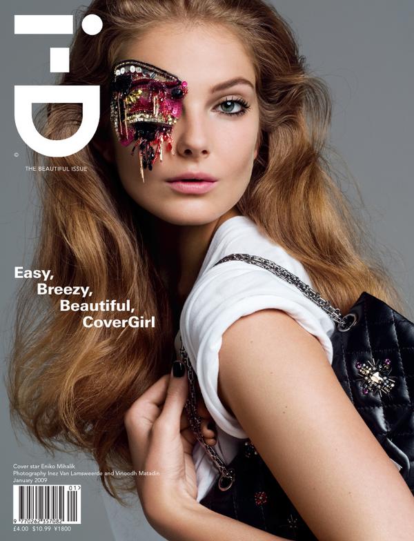
 i have looked at each of these 4 magazine covers and decide i like features from all of them and i am foing to use them as inspiration when putting together the layout/ design of my magazine cover.

Tuesday, 24 January 2012

Music magazine pitch


PITCH EVALUATION
i think my magazine pitch went well, in the picth i included nearly every feature people would want to know about my magazine, changes i have made are that i originally priced my magazine at £4-£5 now overlooking this pricing and from the feedback/ comments made i am going to lower it to around £3.50 so its more affordable and appeals more to the age goup i am aim to, i also am changing my target age from 15-25 to 17-25 because from the feedback i feel this would be more appropriate.

Monday, 23 January 2012

Audience profile

Typical target for my music magazine,

Lucy-anne, 19 years old student, studies musical arts at a university in London, she lives in a flat with 4 girls, and spends her free time socialising, on weekends her flatmates love going out to bars and clubs around London and love listen to varieties of music, her typical taste in music would be anything current and popular she loves strong female solo artists such as beyonce and rihanna and has quite a girly taste in music, Lucy has a very quirky fashion sense and shops in high street stores such as topshop and H&M and also in charity shops because of the tight budget she is on, she likes to put her own clothes together to create new styles, and last yeat lucy attended glastonbury festival with her flatmates and loved it. she is quite outgoing and doesn’t get much free time to sit and chill because of the workload she receives and the fact that she is always on the go and spends most of her time travelling from place to place on trains and in taxi's so she doesn’t have time to watch music channels and check out the latest chart music, so a magazine for her is ideal because she can put it in her bag and read it on her commute, because of the student bugdet lucy wouldnt want to pay more than £4 for her music magazine a music magazine, and what she wants from the magazine is to know latest chart songs, upcomong artists and upcoming music events/ festivals,

colour palette's


1The first colour palette i have decided to test out is black white and purple, i have already decide i want to use black and white because i feel they both just work and pop off each other so I’m colour testing to find a third colours that appropriate, i think purple works well because its bright and would stand out it i think it would also look good with text/special offers over it and its a ‘poppy’ colour so it in keeps with the magazine genre, and is definitely something to keep in mind.

2I have tested out grey with my black and white, although this isn’t a traditional ‘pop’ colour, i have taken inspiration for this colour palette from fashion magazines such as a few vogue covers and i think it looks professional and interesting, although this would work, i think would rather stick to my bright/ quirky colours to compliment the magazine.


3Another combination of colours i have chosen to put together is black, white and bright pink, i taken this inspiration from the Rihanna NME magazine special where i think it looks great and stand outs and looks the part, pink is a really quirky colour so would be perfect, although i want to keep the magazine suitable for both genders i am having a female solo artist on the front so it would complement the singer.


4My last colour palette testing was- black, white and a mint green, now this is an unusual combination and i don’t think ive seen it used before but i think the three go together well and the green is so quirky i think it would pop well if put on the cover and could create something really interesting, so at the moment i am chosing between colour palette number

Font styles


My name for my  music magazine  is 'MUSIQ' so for research  for my masthead i have been  onto dafont.com and    researched  into what   kinds of   fonts that  would   work and wouldn't  work, my  magazine is a  pop/ mainstream magazine but i want to make it as edgy as i can but in keeping with genre of the music.                                                                                                                                                        i have categorized two different types of text the firstone being bold  chunky written  in a techno style i have collected 7 of these which i think suit the name and would work brilliantly, i have then collected 3 in a similar writing style but in white text with black box's around them i think this would be a good style for the masthead     of the    magazine   because its bold     and     eye-catching and i think it leaves you to create and styles the background for the cover,                                                          my four  favourite  fonts  are  number1,number4, number7  and,    number10,         the decisions i have made are that i am going to use one of these four and i like these particular fourbecause i have an idea for the cover and can imagine them fitting in with my theme for the cover.

Magazine covers, contents pages & dbs analysis

78668552 Presentation 1